Redesigned My health feature of Apollo 24|7
A concept redesign of My Health to increase feature activation and encourage users to bring more of their health data into Apollo.


Himanshu
Got a Minute?
Quickly know what we did
The Prototype video contains representation of following screens/ actions-
Feature Onboarding
Document uploading
Reports page
Prescription page
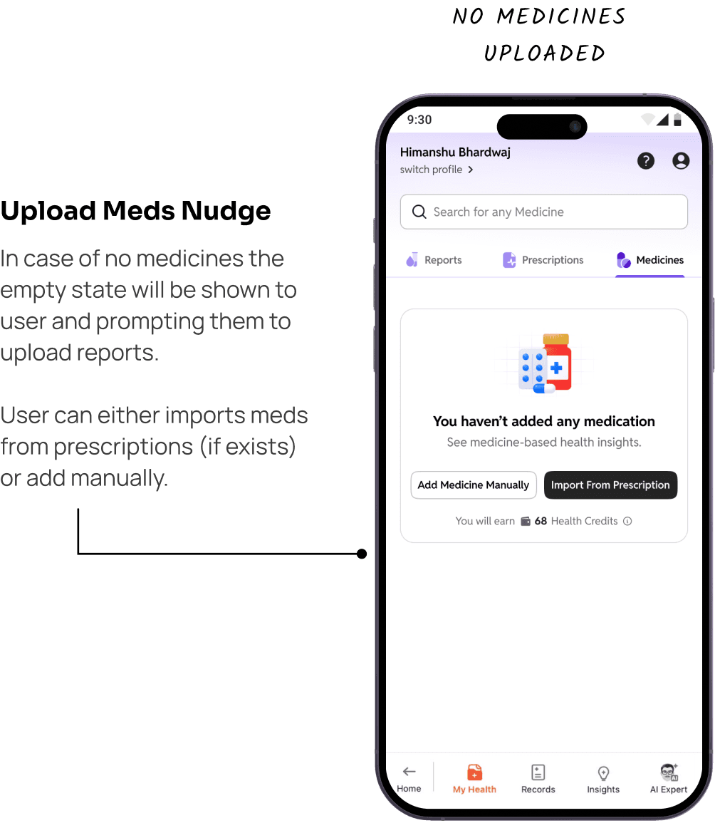
Medicines page
Quick Overview
Problem
Poor value communication causes early drop-off, no feature activation and low data contribution for personalized insights.
Things I decided to do
Designed onboarding based on users who have Apollo data vs users who don't
Restructured the content architecture to align with mental model of user.
Added a profile completion nudge to capture health history data and more
What I made
Made feature onboarding simple:
For FTU’s made the feature onboarding simple and intuitive
Brought value upfront :
Enhanced the value exchange of feature so that users add more data.
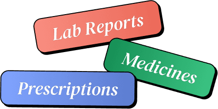
"Three types of health data that makes health management complete"
Enjoyed the quick peek?
Let’s delve deeper into the project
Why I Chose Apollo 24|7?
A refined 'My Health' feature can position Apollo as India’s ultimate unified health platform.
Apollo holds unmatched longitudinal user data across its pharmacies, labs, and hospitals that companies don't.
Apollo's advantage is that it can say: "We already know part of your health story.
CORE OBSERVATION
Today, Health Insights feels passive. Reimagining it turns Apollo from a transactional service into an active health management partner.

Then I Began With Identifying The Problem And Hypothesis
Problem

My Health lacks sufficient data to deliver meaningful personalization, as Apollo only holds a fraction of a user's health history. The core friction is getting users to contribute more records.
Hypothesis
Delivering upfront value through existing Apollo records will prove the feature's worth, motivating users to link external health data.
A Quick Research
Did research to get answers of following questions
Why do users not connect or continue adding health data to healthcare platforms?
Is health record management actually required by users or is it a Feature Market Fit problem?
Info from secondary Research
Many competitors such as Tata 1mg and Eka Care already has health record features
WhatsApp is the default health record folder for most Indians. Labs send PDFs over WhatsApp.
Privacy anxiety is real. ~75% of users are concerned about privacy when using health apps
Digital access is high but shallow. 71% of adults accessed medical records digitally

Primary Research
I Recruited 6 Users (some who had used Apollo's health features, some who hadn't)

About storing health records
"All my reports are in WhatsApp. The number one reason is I can just forward it to my doctor."
"My dad navigates to WhatsApp's documents section every time they need a report."
“Maine khud ka ek group bana liya hai. Usmein main akeli hoon. Usmein maine saari reports daal di."
About understanding health data
"I take a picture and give it to ChatGPT — first of course I take a picture and give it to ChatGPT."
"How am I supposed to comprehend readings high or low? Maybe they can't tell me but it would be helpful."
"So much technical term that I did not know. So I took the report to doctor and asked him to explain each part."
About sharing info on doctor visits
"It's a lot to tell the doctor. It's a lot for the doctor to comprehend at one time."
"I don't give background because I don't remember."
"I had lack of confidence, main doctor ko judge bhi nahi kar sakti thi kitna sahi bata raha hai kitna galat."
Final Design
But something didn't add up...
After research i found that-
Zero upfront value led to poor engagement and drop-off. Without a clear payoff, users saw no reason to upload more data.
The product had the right tools, but hidden placement and weak messaging hid their worth.
'It has an issue of feature discoverability and value communication.
The Turnaround
I realised that data drop-off is merely a symptom. Fixing onboarding and front loading the feature value can directly unlocks user participation.
So, I refined the problem and changed my approach
How to make users understand what is My Health before asking them to add more data?
Our initial hypothesis focused on increasing health-data collection. However, we realised that users needed clearer context, feature education, and motivation before taking action.
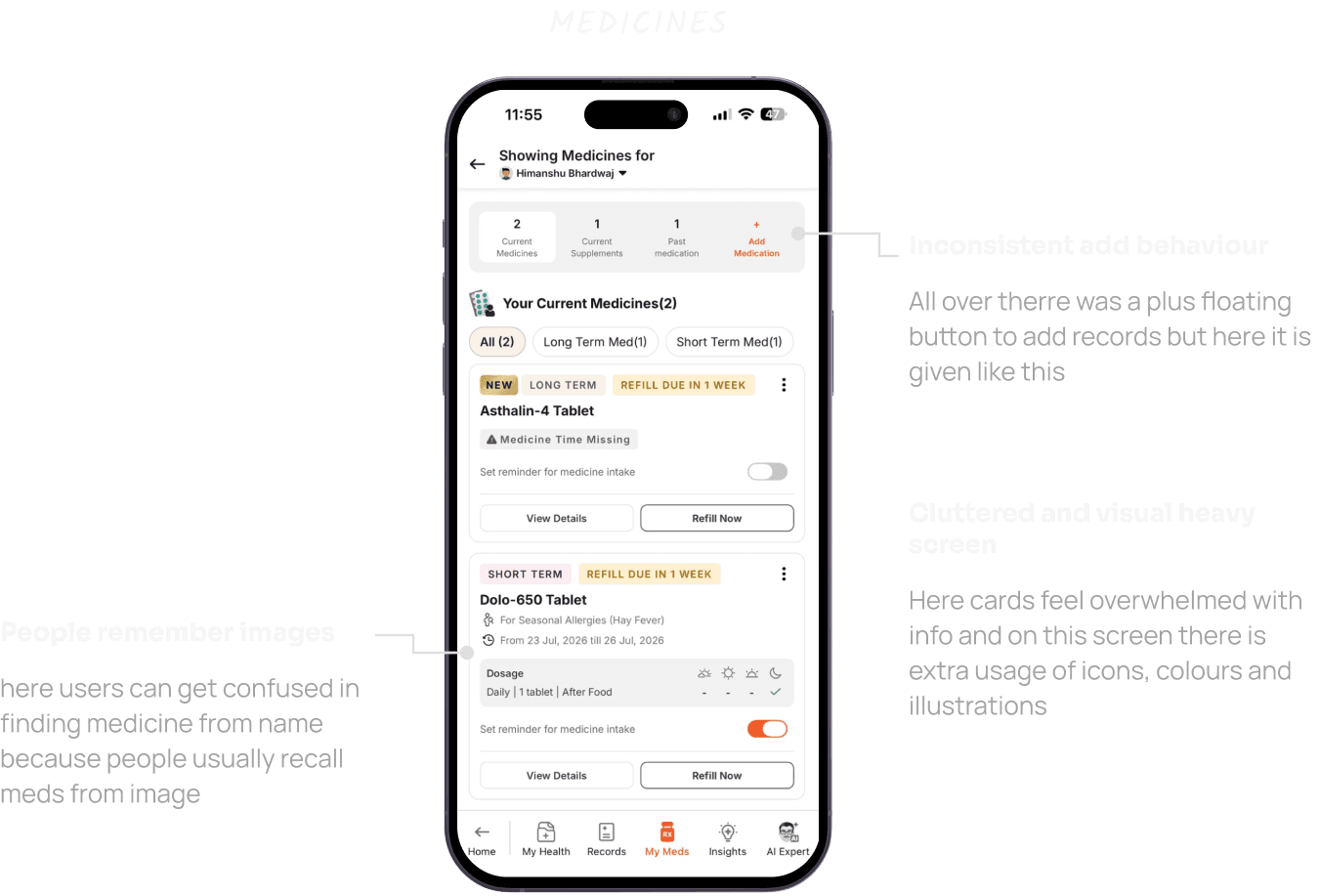
UX Audit of the whole flow in depth
Use the whole product and point out what all possible frictions are there from ux point of view
This is what Apollo’s My health looks like
Audit of 'My Health' Screens


The Solution I Propose In This Redesign
TAILORED ONBOARDING
Design dedicated onboarding and a starting action based on user type and their job to be done, so users get clarity from the start.
FEATURE DISCOVERY
Streamline the content architecture and personalise sections around users’ mental models, making the feature easier to understand and more relevant.
CONTEXTUAL ACTIVATION
Introduce contextual nudges to help users add more data without feeling forced, enabling deeper personalisation throughout the experience.
Key Deliverables
01
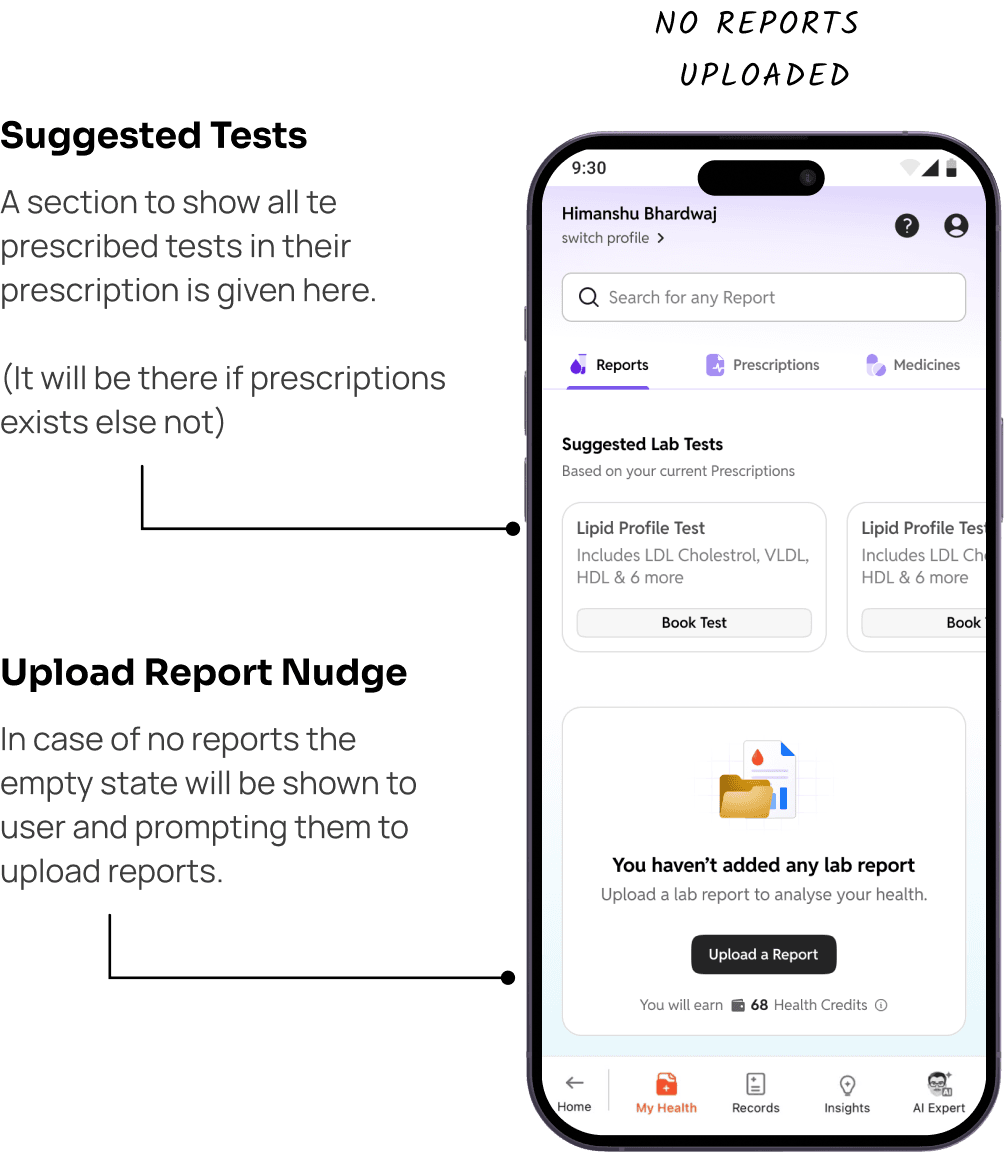
Onboarding for FTUE but 'no health data' exists scenario.

02
Onboarding for FTUE but apollo ‘already has health data’ scenario.

03
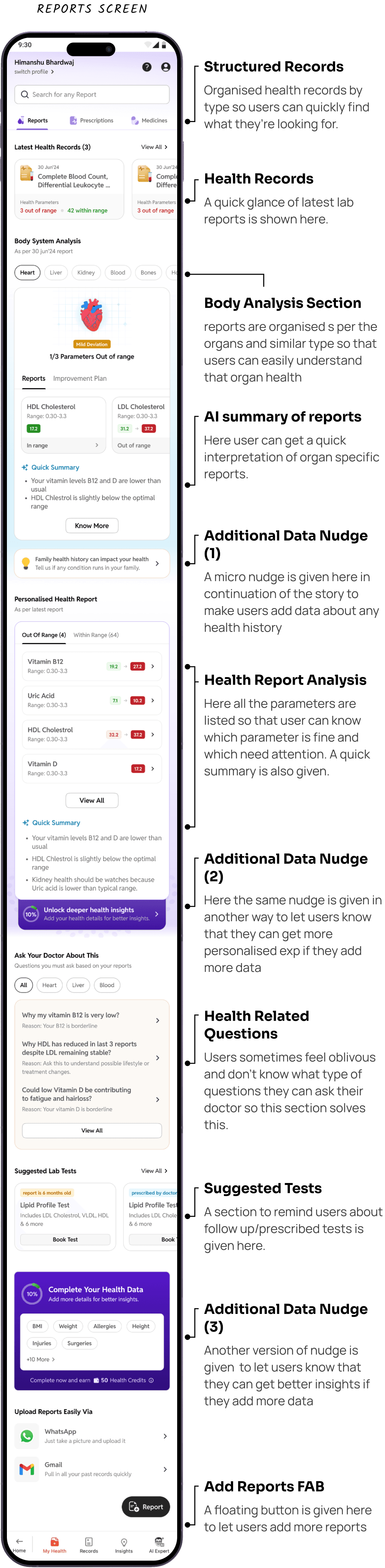
Improved content architecture that resembles mental model

04
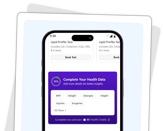
Multiple nudges in between to make user add more health info in the system
05
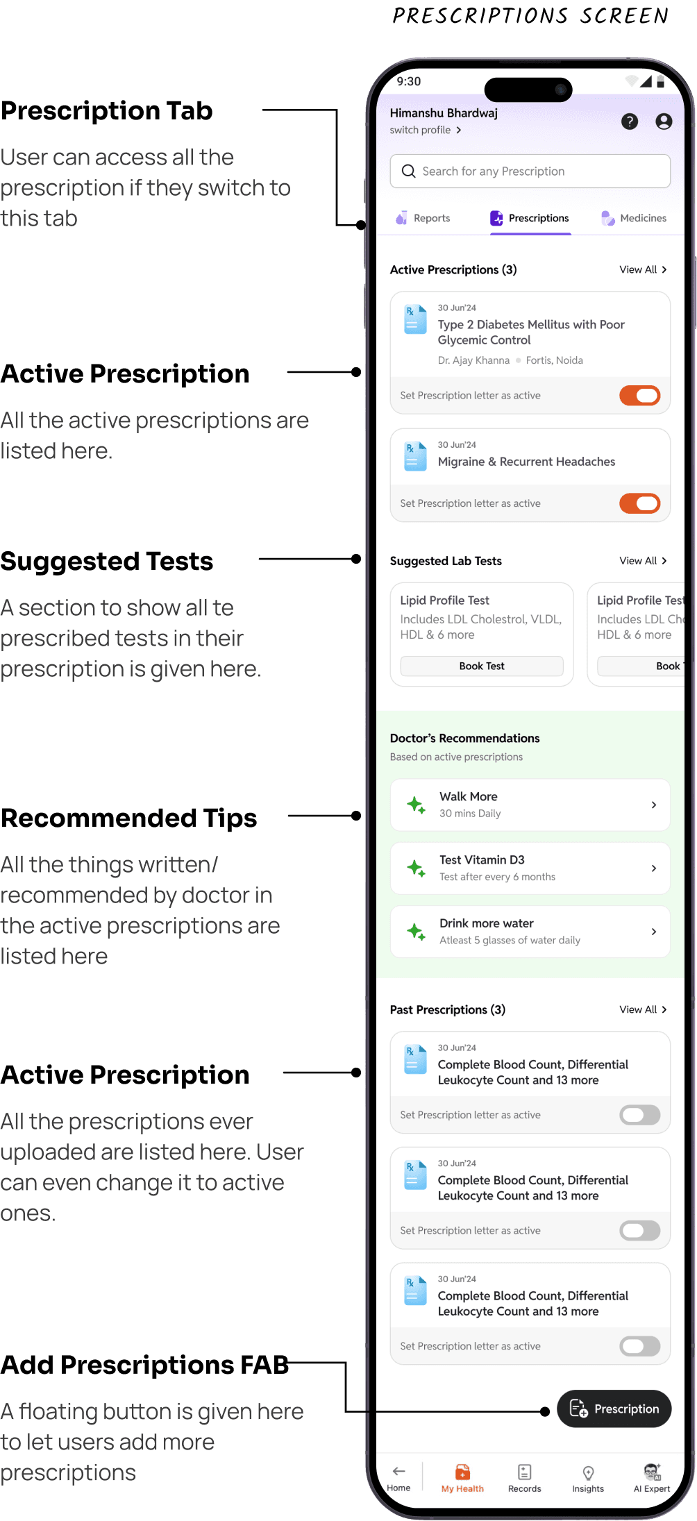
Decluttered the prescriptions page and added few sections to track prescribed things.

06
Improved medicine records page and added insights section to give value to users

Designs that didn't make the cut
Iterations

The Changes
Tried multiple variations of hero section and upload document in my health screen and finally decided to keep one action instead of document type bifurcation
Made a folder tab style ui and duo-tone stroke icons of records organisation but dropped it as it was visually cluttered
Tried to keep meds categories on top and auto scroll functionality but dropped it as it was making the page lengthy.
Kept consistent ui for adding documents by using fab and removing add medicines from top.
Felt the visual design of health records was noisy because of colours in cards and organs image in tabs
Combined parameters and personalised health report section together because i realised both sections is giving same info but just showing it in different way, hence no value addition
Final Design
UI That Went Live
Core Screens



Empty States/ Edge Cases


Supporting Screens



Up Next
Explore More Projects

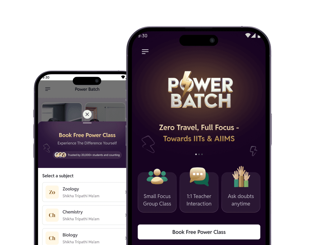
Improved MLP to Drive More Batch Enrolments.
Redesigned the demo booking flow and MLP to drive conversions for high-value batches.

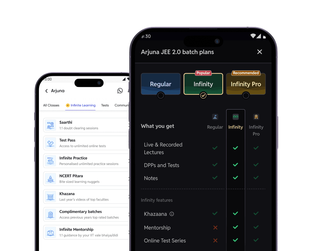
Turning One-Time Purchases into Scalable Learning Plans
Designed a plan-based model that unlocked user choice and higher revenue.

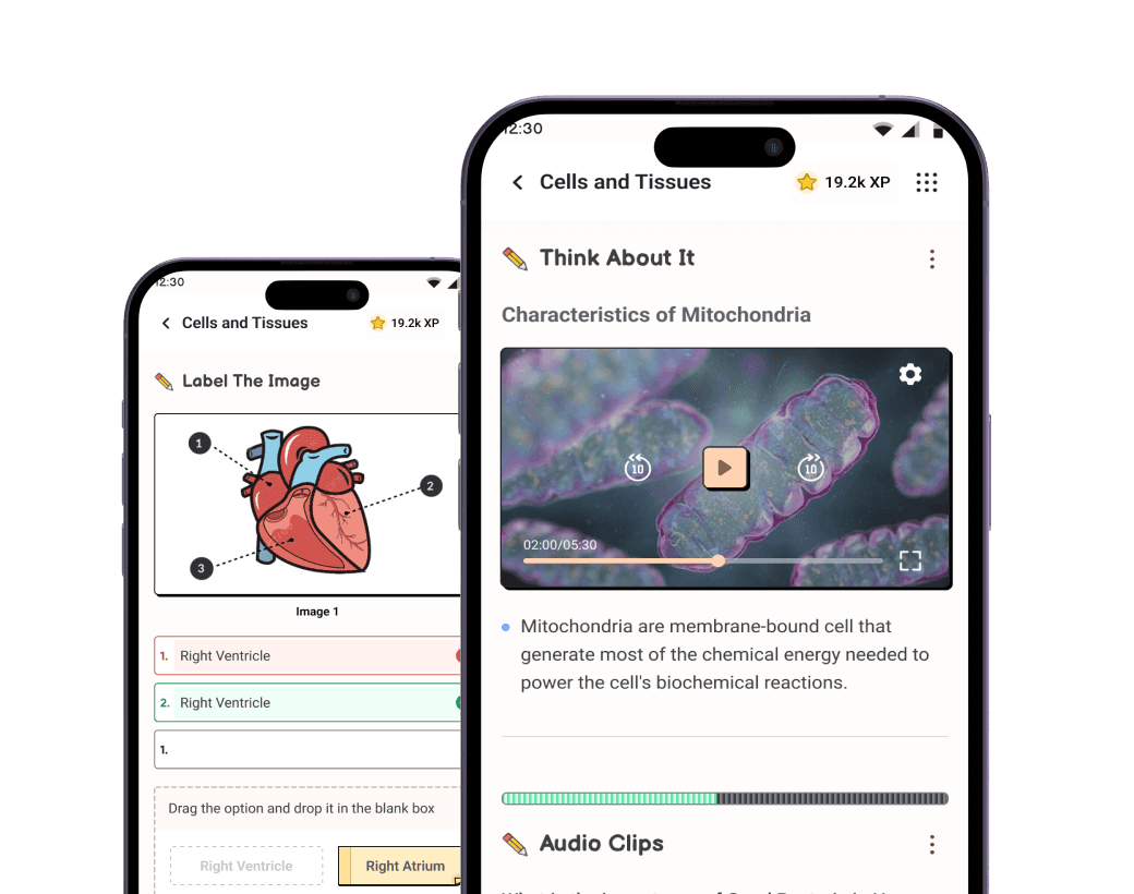
A Gamified Framework for Smart & Quick Revision
Introduced 13 interactive nuggets to make NEET prep engaging for 2L+ students.

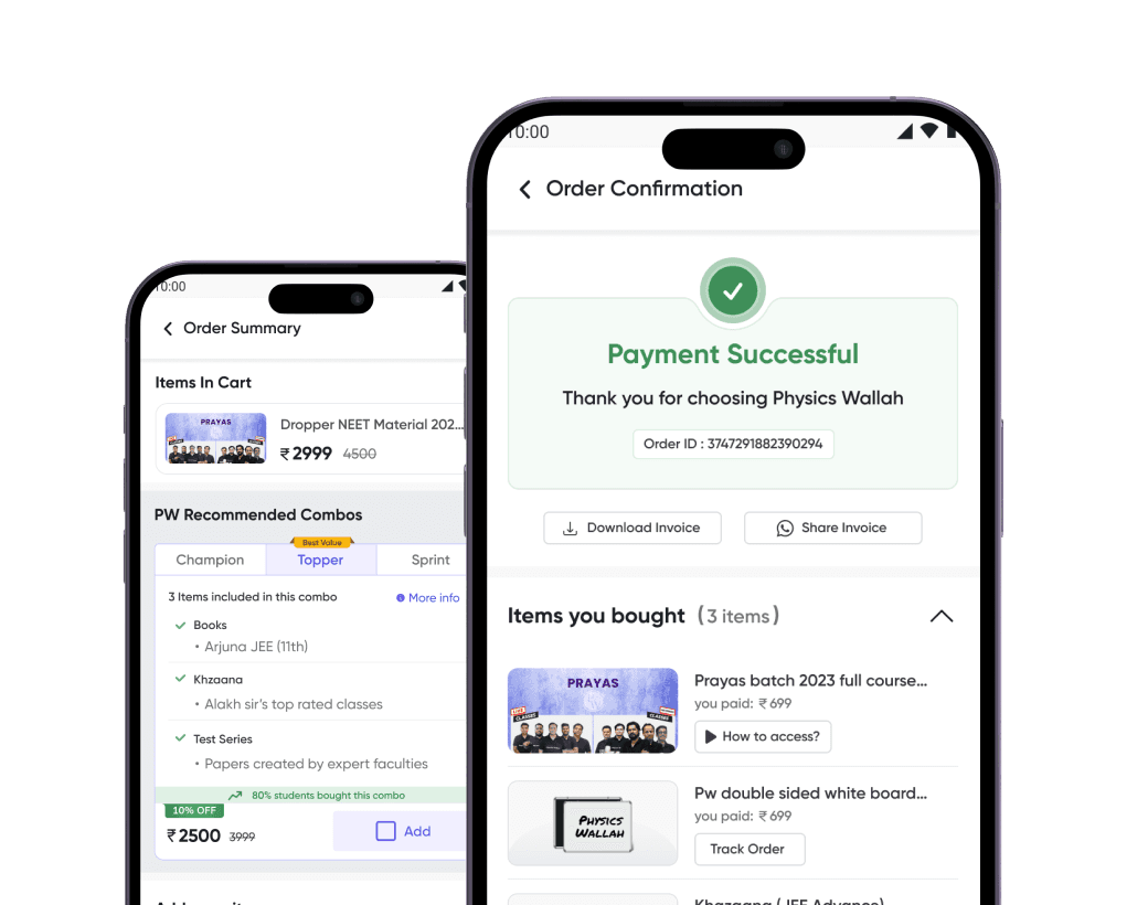
Redesigning PW’s Batch Purchase Flow.
Designed end-to-end purchase flow covering summary, coupons, and order confirmation

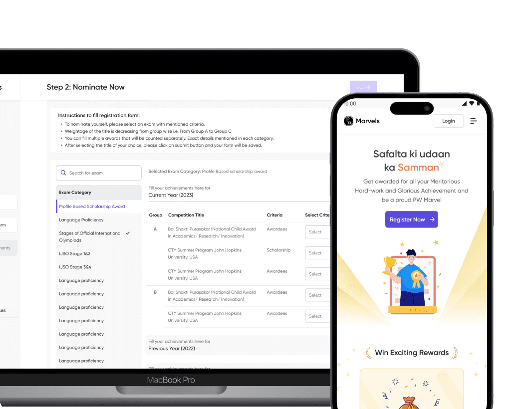
A Ranker Holder Lead Generation Platform
Designed lead generation platform that enabled PW to acquire top rank holder students.